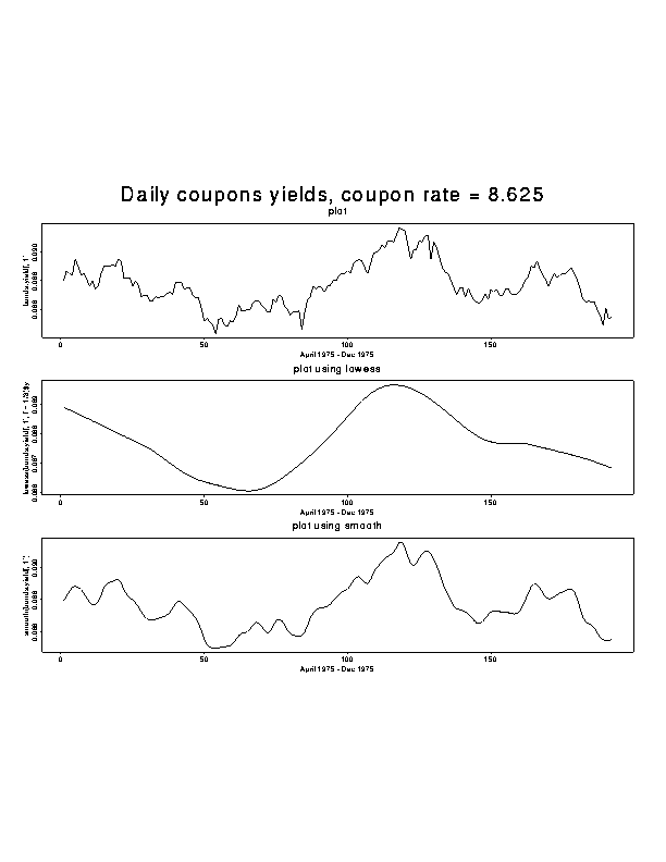
plot(x,y,...)
> xl_"April 1975 - Dec 1975"> X11(); par(mfrow=c(3,1),oma=c(0,0,4,0))
> plot(bonds.yield[ ,1], xlab=xl, main="plot", type='l')
> plot(lowess(bonds.yield[ ,1],f=1/3),xlab=xl, main="plot using lowess", type='l')
> plot(smooth(bonds.yield[ ,1]) ,xlab=xl, main="plot using smooth", type='l')
> mtext(outer=TRUE, line=1, cex=1.5, "Daily coupons yields, coupon rate = 8.625")
> dev.off()
When only one variable is specified in the arguments to plot(), the values of the variable are plotted against their indices, or against time in the case of time series data.
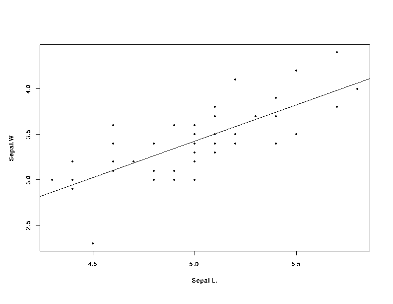
The data iris is a 3-dimensional array (arrays are matrices and higher dimensional generalizations of matrices) with 4 measurements on 50 flowers from each of 3 species of iris. The following command extracts all the data for one of the species.
> setosa_iris[ , ,1]
> X11(); plot(setosa[ ,1], setosa[ ,2], xlab="Sepal L.", ylab="Sepal.W")
> abline(lsfit(setosa[,1],setosa[,2]))
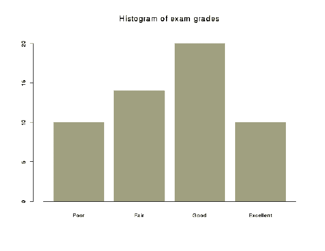
barplot(x,names=NULL,...)
Creates a bargraph. Several options are available including verticle or
horizontal bars and shading patterns.
names=NULL character vector of names for the bars> grades_c(10,14,20,10)
> grade.names_c('Poor','Fair','Good','Excellent')
> barplot(grades, names=grade.names, main="Barplot of exam grades")
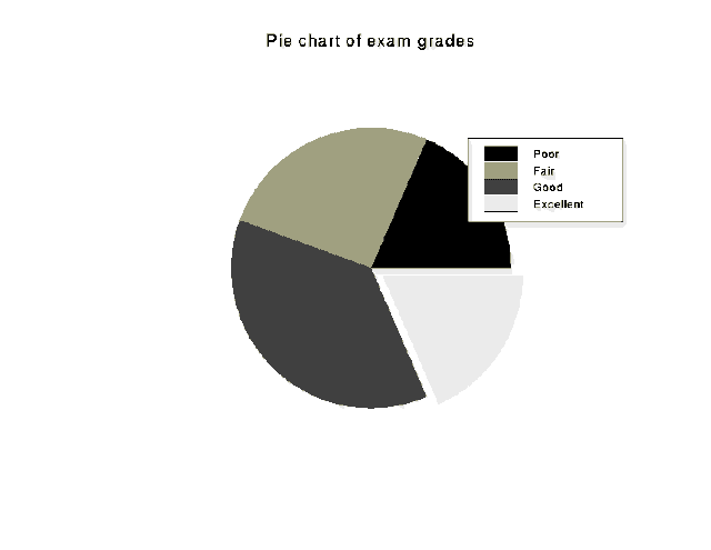
pie(x, names=NULL, explode=F, ...)
Creates a pie chart from a vector of data.
names=NULL  vector of slice labels
explode=F   logical vector specifying slices which should be exploded
> pie(grades, explode=c(F,F,F,T), main="Pie chart of exam grades")
> legend(1.5,2, legend=grade.names, fill=1:4)
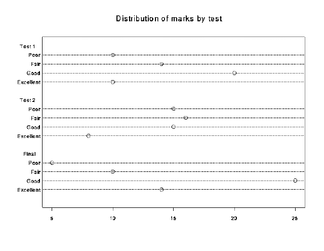
dotchart(x, labels= , groups=NULL, pch="o",...)
Creates a dot chart from a vector of data. A grouping variable, and a
group summary may be used along with other options.
labels=      vector of labels for the data values
groups=NULL  categorical variable used for splitting data into groups
pch="o"      plotting character
> grades_c(10,14,20,10,15,16,15,8,5,10,25,14)
> grade.group_factor(c(1,1,1,1,2,2,2,2,3,3,3,3), labels=c("Test 1","Test 2", "Final"))
> dotchart(grades, labels = grade.names, group = grade.group, pch= 1)
> title(main = "Distribution of marks by test")
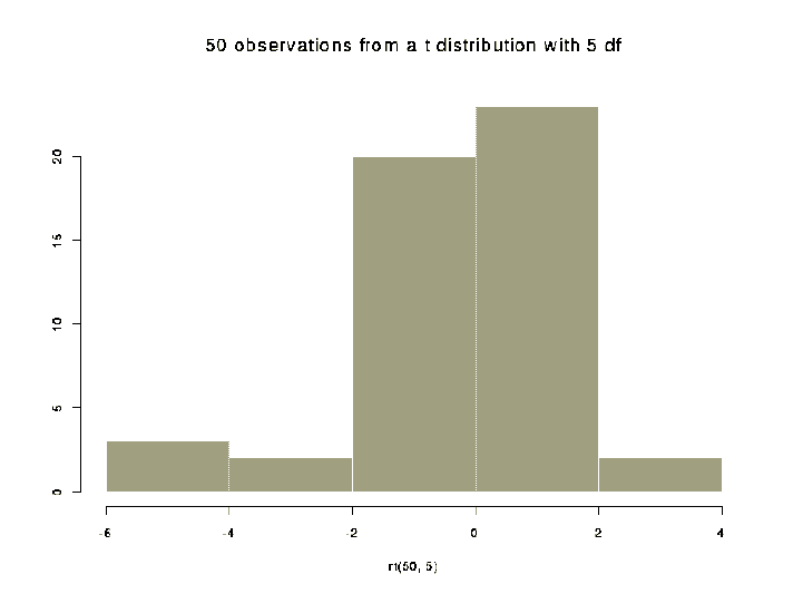
hist(x, nclass= , breaks= , probability=F,...)
Creates a histogram. The same options available in barplot() are
available in hist().
nclass=        specifies the number of classes (ie.:  bars)
breaks=        vector of the break points for the bars of the histogram
probability=F  if TRUE, the histogram will be scaled as a probability density
> hist(rt(50,5), main="50 observations from a t distribution with 5 df")
density(x, n=50, na.rm=F,...)
Returns x and y coordinates of an estimate of the probability density of the
data.
n=50       number of equally spaced points at which to estimate the density
na.rm=F    logical flag: by default missing values generate an error message
width=     width of the window used in the computation
           the larger the value, the smoother the density
> normal_rnorm(100)> ndens_density(normal, width=0.9)
> hist(normal, probability=T)
> lines(ndens)
Specifying probability=T scales the histogram as a probability density so that both the line and the histogram are in the same scale. The demo() function shows an example where the histogram was not scaled but rather the ylim= argument was specified to achieve a similar effect.
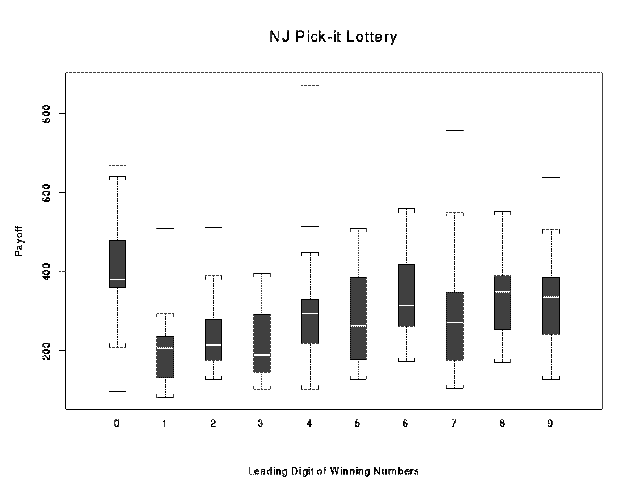
boxplot(...)
Produces side by side boxplots from a number of vectors. The boxplots
can be made to display the variability of the median, and can have variable
widths to represent differences in sample size.> x <- lottery.payoff
> group <- lottery.number %/% 100
> boxplot(split(x, group), ylab="Payoff")
> title(main = "NJ Pick-it Lottery", sub = "Leading Digit of Winning Numbers")
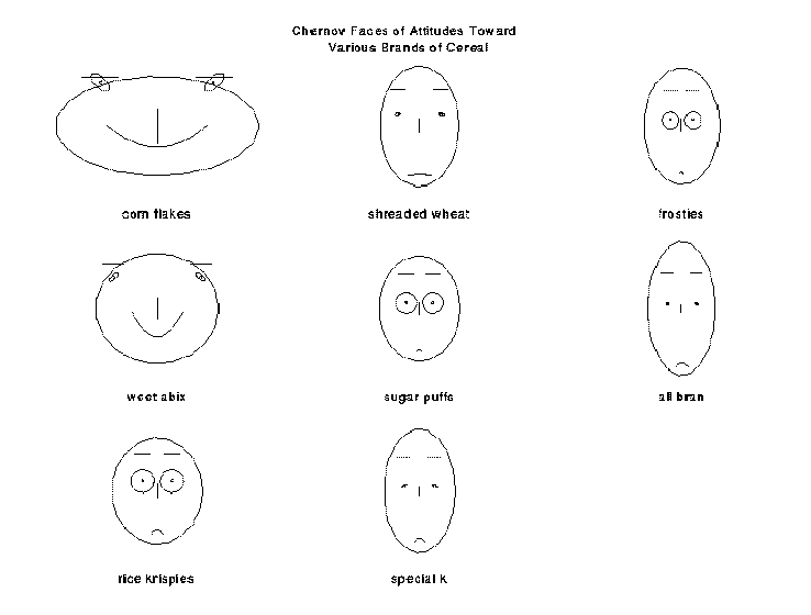
faces(x, labels= , head= ,... )
Represents each multivariate observation as a face.
labels=   vector of character strings for labelling the faces
head=     overall title for the page
> cereals_t(cereal.attitude)
> faces(cereals, labels = dimnames(cereals)[[1]], head = "Chernov Faces of Attitudes Toward \n Various Brands of Cereal")
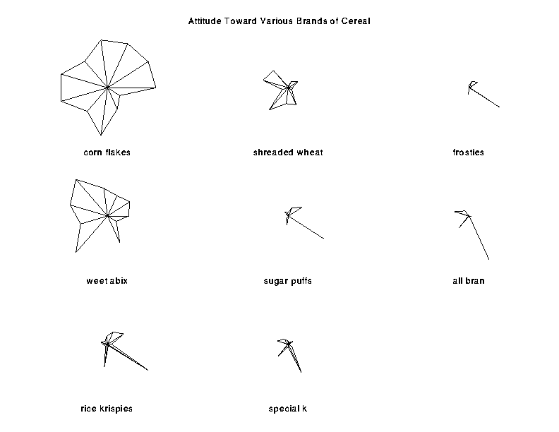
stars(x, labels= , head= ,...)
Star Plots of Multivariate Data
labels= vector of character strings for labelling the stars head= overall title for the page>stars(cereals, labels = dimnames(cereals)[[1]], head = "Attitude Toward Various Brands of Cereal")
pairs(matrix, ...)
Produces all pair-wise scatter plots.