- a)
The association between the pollutants is negative as high values of one variable tend to occur
with low values of another.
The plot is clearly curved with an outlier at the top of the plot. This is one car with high nitrogen levels. - b)
No. As said before, a negative relationship denotes high values of one variable with low
values of another. In this case, high nitrogen levels are associated with low carbon monoxide
levels, while high carbon monoxide levels are associated with low nitrogen levels. The claim
that you can find out how badly a car is polluting by testing one pollutant is not supported here.
- a)
MTB > plot c2 c1 - ** country - * - * - 240+ - * * - * * * - * * - * 160+ * * - - * - * * - 80+ * - * - --------+---------+---------+---------+---------+-------- alcohol 1.6 3.2 4.8 6.4 8.0 MTB > - b)
As you can see, there is a linear pattern in the plot and the linear relationship is fairly strong.
- c)
The variables have a negative relationship meaning countries with a high consumption of wine have fewer deaths due to heart
disease and countries with low wine consumption have more deaths due to heart disease. Although there is a correlation,
this does not mean wine consumption lowers the risk of heart disease. There may be other factors involved.
- a)
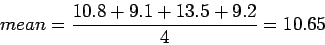
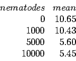
MTB > plot c1 c2

          -
     10500+
          -   *          * *       *
  worms   -
          -
          -
      7000+
          -
          -
          -          * * *         *
          -
      3500+
          -
          -
          -
          -                            *              **
         0+                                 *       *             *
            ------+---------+---------+---------+---------+---------+seed
                4.0       6.0       8.0      10.0      12.0      14.0

 MTB >
The mean is the average of all the data points divided by the number of points. For 0 nematodes:
All means are listed in the table below.
MTB > plot c1 c2 - 10500+ - * worms - - - 7000+ - - - * - 3500+ - - - - * 0+ * --------+---------+---------+---------+---------+--------mean 6.0 7.0 8.0 9.0 10.0 MTB > - b)
The scatter plot shows that the growth of the plants has a big drop between 1000 and 5000 nematodes.
MTB > plot c2 c1

          -
  round2  -                       *
          -
          -                     *
      90.0+
          -                   *               *                   *
          -           *               *
          -
          -                         *
      84.0+
          -
          -                 *
          -   *
          -
      78.0+
          -
          -       *
            ----+---------+---------+---------+---------+---------+--round1
             80.0      85.0      90.0      95.0     100.0     105.0

 MTB >
Correlation with all observations = 0.550
Correlation without observation 7 = 0.661
As you can see player 7 is not in the relatively linear pattern of bad first found followed by good second round. Without this data the scatter plot is more linear.
- a)
 MTB > plot c2 vs c1

          -
          -  *                                              *      *
      0.40+
          -
  y       -
          -
          -
      0.00+
          -
          -
          -
          -
     -0.40+
          -         *
          -
          -  *                                                     *
          -
            --------+---------+---------+---------+---------+--------x
                 -3.0      -1.5       0.0       1.5       3.0

 MTB >
The correlation between x and y and the correlation between x* and y* both equal 0.253. This is because the correlation, r, does not depend on the scale units of x and y.
- a)
MTB > plot c2 c1 - - * 1400+ * - * y - - * - * 1050+ - * - * - - * 700+ * - * - - * - +---------+---------+---------+---------+---------+------x 0.0 2.0 4.0 6.0 8.0 10.0 MTB > - b)
x = 20, simply substitute 20 into
y = 500 + 100x.
This gives y = 500 + 100(20) = 2500, so after 20 years Fred has
 in his mattress.
- c)
If Fred adds
 per year to his savings instead of
  per year the equation becomes
y = 500 + 200x.
Think of 200 as the slope of a line. If the slope is larger Fred will save more money faster.
per year the equation becomes
y = 500 + 200x.
Think of 200 as the slope of a line. If the slope is larger Fred will save more money faster.
- a)
MTB > plot c2 c1

          -                                                       *
        48+                                                         *
          -
  killed  -                                                *
          -
          -                                          *
        36+
          -                         *    *     *
          -
          -
          -
        24+         *      *
          -     *
          -               *
          -             *
          -                  *
        12+  *
            --+---------+---------+---------+---------+---------+----boats
            450       500       550       600       650       700

 MTB >
The plot shows a reasonably strong positive linear relationship. - b)
The correlation coefficient is
r = 0.9414. Now by finding r2 we can find the fraction of variation in
manatee deaths. This is
r2 = (0.9414)2 = 0.886 or
 .
The predictions are relatively accurate.
.
The predictions are relatively accurate.
- c)
Using Minitab, we find the least-squares regression to be
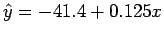 ,
remember this applies to
number of boats in thousands. So when
x = 716,000 we predict that
,
remember this applies to
number of boats in thousands. So when
x = 716,000 we predict that
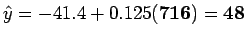 manatees will be killed.
- d)
Now we assume there are
x = 2,000,000 powerboats. Remembering the regression line applies to boats in thousands we
predict that
 manatees will be killed. Since 2,000,000 is well beyond the range of
x, extrapolation makes this prediction unreliable.
manatees will be killed. Since 2,000,000 is well beyond the range of
x, extrapolation makes this prediction unreliable.
- e)
Two of the points, 1992 and 1993, are below the overall linear pattern, besides this there is no strong evidence the measures
were successful.
- f)
The mean for these years is 42. This is actually less than our predicted mean of 48. This indicates that some of the
the measures taken did work.
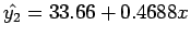
- a)
The least-squares regression line is
 .
So the slope is b = 0.16 and the intercept is a = 30.2.
.
So the slope is b = 0.16 and the intercept is a = 30.2.
- b)
Since we know
,
we predict Julie's score to be
 or
or  .
.
- c)
We are given the correlation, r = 0.6. So
r2 = 0.36. So only
 variability in y can be accounted for by the regression.
Julie's actual score could be very different from the predicted score.
variability in y can be accounted for by the regression.
Julie's actual score could be very different from the predicted score.
- a)
Male height on female height:
Female height on male height:
Multiplying the two slopes we get r2 = 0.3196 because the standard deviations cancel each other out.
- b)
We know regression lines always pass through
 ,
so the two regression lines intersect at
(66,69).
,
so the two regression lines intersect at
(66,69).
 mean female height and
 mean male height.
- c)
Converting from inches to centemetres would not effect the slope and intercept because all data would still relate. The only
difference is the scale would be different.
- a)
MTB > plot c2 c1 mass - * (kg) - - * 7.2+ * * * * * - - * - - * 6.0+ - * - - - * 4.8+ - - * - ------+---------+---------+---------+---------+---------+age (months) 2.0 4.0 6.0 8.0 10.0 12.0 MTB > - b)
You can easily see the pattern is not linear.
- c)
The sum of the residuals is 0.1, with round-off error, 0. Plotting the residuals against age we see the first and last residuals
are negative. The inner residuals are positive.
- a)
MTB > plot c2 c1

          -
       450+
          -
  1980    -                                                       *
          -
          -
       300+
          -
          -
          -
          -                       *               *
       150+                    *
          -                 *       *
          -            *
          -
          -   ** **   *
         0+  *
            +---------+---------+---------+---------+---------+------1970
            0        25        50        75       100       125

 MTB >
itemb) Sea scallops can be considered an outlier, it's data point is farther away than the rest, but not that much from the pattern. The best-fit line will change a small bit when this point is removed. Lobsters can also be an outlier, but not so much as scallops.
- c)
The correlation for the entire data set is r = 0.967 and
r2 = 0.935. So we can say
 of the variation in 1980
prices can be explained by 1970 prices.
of the variation in 1980
prices can be explained by 1970 prices.
- d)
Taking scallops away, r = 0.940 and taking scallops and lobsters away, r = 0.954. We can see the correlation drops slightly
the data is less scattered without the outliers. This makes the scatter about the line greater with the rest of the data.
- e)
The plot does show a linear relationship.
STATISTICS 1060 HOMEPAGE PREVIOUS PAGE
Jonathan Payne
1999-01-22